Data Preparation and Analysis
Introduction to Data
The data set at hand is divided into three different trials 95-trial, 100-trial and a 150-trial. There is three seperate csv files per trial. Let’s take the 95-trial - we have a csv file that records the participants choices, a csv file that records the participants losses and a csv file that records the participants winnings.
As all of the data is not gathered from one study but is in fact gathered from 10 seperate studies, to handle this we are given a fourth csv file which maps what study each participant took part in.
The studies differ in many ways from the size of the actual trials to the age demographics of the studies.
Libraries used
import numpy as np
import pandas as pd
from scipy.stats import norm
import seaborn as sns

import matplotlib.pyplot as plt

from numpy import arange

import sklearn
from sklearn.cluster import KMeans
from mpl_toolkits.mplot3d import Axes3D

import sklearn.metrics as sm
from sklearn.decomposition import PCA
from sklearn import datasets
from sklearn.metrics import confusion_matrix, classification_report
df95 = pd.DataFrame()
df100 = pd.DataFrame()
df150 = pd.DataFrame()

df95["Total W"] = win95.sum(axis=1)
df95["Total L"] = loss95.sum(axis=1)

df100["Total W"] = win100.sum(axis=1)
df100["Total L"] = loss100.sum(axis=1)

df150["Total W"] = win150.sum(axis=1)
df150["Total L"] = loss150.sum(axis=1)

df95.reset_index(inplace=True)
df100.reset_index(inplace=True)
df150.reset_index(inplace=True)

df95["Study"] = index95["Study"].values
df100["Study"] = index100["Study"].values
df150["Study"] = index150["Study"].values

df95["Margin"] = df95["Total W"] + df95["Total L"]
df100["Margin"] = df100["Total W"] + df100["Total L"]
df150["Margin"] = df150["Total W"] + df150["Total L"]

df95["count_zeros"] = zeros95["zeros"].values
df100["count_zeros"] = zeros100["zeros"].values
df150["count_zeros"] = zeros150["zeros"].values

df95.size + df100.size + df150.size #2468

final = pd.DataFrame()
alternative = pd.DataFrame()
alternative = df95.append(df100)
final = alternative.append(df150)
final.size #2468
final.head()
| index | Total W | Total L | Study | Margin | count_zeros | |
|---|---|---|---|---|---|---|
| 0 | Subj_1 | 5800 | -4650 | Fridberg | 1150 | 80 |
| 1 | Subj_2 | 7250 | -7925 | Fridberg | -675 | 71 |
| 2 | Subj_3 | 7100 | -7850 | Fridberg | -750 | 76 |
| 3 | Subj_4 | 7000 | -7525 | Fridberg | -525 | 76 |
| 4 | Subj_5 | 6450 | -6350 | Fridberg | 100 | 76 |
Data visualisation
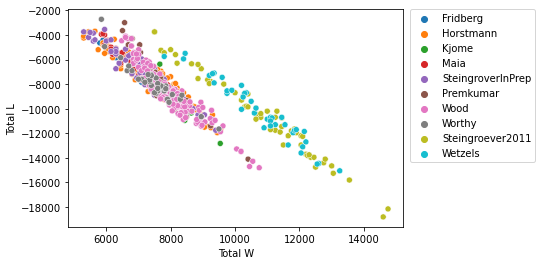
sns.scatterplot(data=final, x="Total W", y="Total L", hue="Study")
plt.legend(bbox_to_anchor=(1.02, 1), loc='upper left', borderaxespad=0)
<matplotlib.legend.Legend at 0x228bf7359a0>
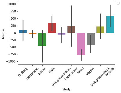
sns.barplot(x="Study", y="Margin", data=final)
plt.legend(bbox_to_anchor=(1.02, 1), loc='upper left', borderaxespad=0)
plt.xticks(rotation=45)
No handles with labels found to put in legend.
(array([0, 1, 2, 3, 4, 5, 6, 7, 8, 9]),
 [Text(0, 0, 'Fridberg'),
  Text(1, 0, 'Horstmann'),
  Text(2, 0, 'Kjome'),
  Text(3, 0, 'Maia'),
  Text(4, 0, 'SteingroverInPrep'),
  Text(5, 0, 'Premkumar'),
  Text(6, 0, 'Wood'),
  Text(7, 0, 'Worthy'),
  Text(8, 0, 'Steingroever2011'),
  Text(9, 0, 'Wetzels')])
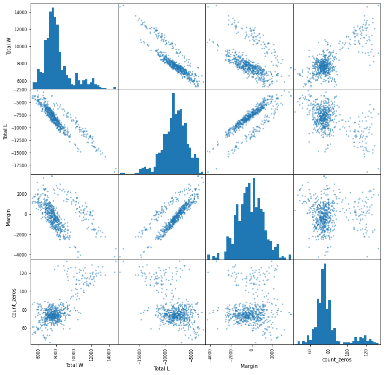
With the scatter matrix plot below I hope the relationships between the different variables will provide me with some interesting insights.
pd.plotting.scatter_matrix(final[["Total W", "Total L", "Margin", "count_zeros"]], figsize=(12.5,12.5), hist_kwds=dict(bins=35))
plt.show()
Observations and wood study visualisations
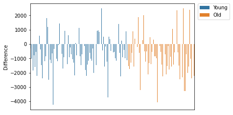
From my above data analysis I can see one study in particular whose margins were surprising. The Wood study in both graphs shows that participants were making considerable losses. Upon inspection this study was ran on two different groups of people. The first 90 participants were between the ages of 18-40 with the remaining 62 participants between the ages of 61-88. My proposal is to look at the difference between the two age groups and see whether the younger participants were quicker to identify the beneficial cards.
The subject dataframe I will use to cluster only the Wood study. This study was ran on two seperate groups with different ages so will hopefully provide interesting results.
subject = pd.DataFrame(columns=["Subjects"])
subject["Subjects"] = win100.index
subject["Difference"] = win100["Total"].values + loss100["Total"].values
subject["Total-B/D"] = choice_new["Total-B/D"].values/100 * 100
subject["Study"] = index100["Study"].values
subject = subject[subject.Study == "Wood"]
subject["AgeProfile"] = ""
subject.AgeProfile.values[:91] = "Young"
subject.AgeProfile.values[91:] = "Old"
print("Subject dataframe")
subject.head(10)
Subject dataframe
| Subjects | Difference | Total-B/D | Study | AgeProfile | |
|---|---|---|---|---|---|
| 316 | Subj_317 | -320 | 56.0 | Wood | Young |
| 317 | Subj_318 | -1030 | 63.0 | Wood | Young |
| 318 | Subj_319 | -1850 | 59.0 | Wood | Young |
| 319 | Subj_320 | -775 | 54.0 | Wood | Young |
| 320 | Subj_321 | -1600 | 65.0 | Wood | Young |
| 321 | Subj_322 | -550 | 52.0 | Wood | Young |
| 322 | Subj_323 | -2210 | 63.0 | Wood | Young |
| 323 | Subj_324 | -450 | 53.0 | Wood | Young |
| 324 | Subj_325 | 590 | 60.0 | Wood | Young |
| 325 | Subj_326 | -380 | 66.0 | Wood | Young |
sns.barplot(x="Subjects", y="Difference", data=subject, hue="AgeProfile")
plt.legend(bbox_to_anchor=(1.02, 1), loc='upper left', borderaxespad=0)
ax1 = plt.axes()
x_axis = ax1.axes.get_xaxis()
x_axis.set_visible(False)
plt.show()
plt.close()
<ipython-input-14-0bcb2aab0190>:3: MatplotlibDeprecationWarning: Adding an axes using the same arguments as a previous axes currently reuses the earlier instance.  In a future version, a new instance will always be created and returned.  Meanwhile, this warning can be suppressed, and the future behavior ensured, by passing a unique label to each axes instance.
  ax1 = plt.axes()
pd.plotting.scatter_matrix(subject[["Difference", "Total-B/D"]], figsize=(12.5,12.5), hist_kwds=dict(bins=35))
plt.show()
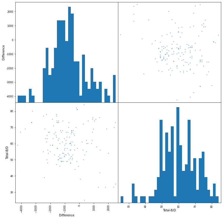
The dataset had a larger representation of younger people, using the dataframe above I will inspect the difference between younger and older both in profit margins and how quick the two age groups were to realise that some cards are more benficial then others. I use different analysis techniques including scatter graphs and k-means clustering to evaluate this hypothesis.
#This is the dataset that we will be using for our clustering of the wood study
subject.to_csv("Data/clustering.csv")

#This is the dataset we will be using for the whole study clustering
final.to_csv("Data/whole_clustering.csv")