Wood Study Clustering
Data preperation and initial clustering
Libararies used
import numpy as np
import pandas as pd

import matplotlib.pyplot as plt

from numpy import arange

import seaborn as sns
import sklearn
from sklearn import preprocessing
from sklearn.preprocessing import minmax_scale
from sklearn.cluster import KMeans
from mpl_toolkits.mplot3d import Axes3D

import sklearn.metrics as sm
from sklearn.decomposition import PCA
from sklearn.preprocessing import MinMaxScaler
from sklearn import datasets
from sklearn.metrics import confusion_matrix, classification_report
Below we have the dataset that we will be using for the clustering of the wood study. We again are using the margin between profit and loss, the percentage of time each participant choose the beneficial cards. We were able to add a column based on the age category of the participant also as each participant falls into two groups “18-40” and “61-88”. After these steps we were able to categorise each subject into cluster based on their metrics.
clustering = pd.read_csv('Data\clustering.csv')
cluster = KMeans(n_clusters = 4)
cols = clustering.columns[:]
clustering.drop(clustering.columns[[0]], axis = 1, inplace = True)
y_predicted = cluster.fit_predict(clustering[["Difference","Total-B/D"]])
clustering["cluster"] = y_predicted
clustering.head()
| Subjects | Difference | Total-B/D | Study | AgeProfile | cluster | |
|---|---|---|---|---|---|---|
| 0 | Subj_317 | -320 | 56.0 | Wood | Young | 0 |
| 1 | Subj_318 | -1030 | 63.0 | Wood | Young | 0 |
| 2 | Subj_319 | -1850 | 59.0 | Wood | Young | 2 |
| 3 | Subj_320 | -775 | 54.0 | Wood | Young | 0 |
| 4 | Subj_321 | -1600 | 65.0 | Wood | Young | 2 |
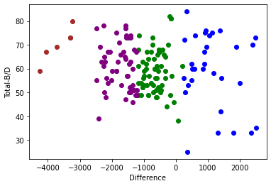
Here we have the inital clustering based on the profit/loss difference and the percentage of beneficial cards picked. As you can see there are a lot of outliers in the data, the four clusters are very distinct and clear. An interesting oberservation is that the majority of the subjects that picked B/D gained the most money but on the other hand they also lost the most money.
df1 = clustering[clustering.cluster==0]
df2 = clustering[clustering.cluster==1]
df3 = clustering[clustering.cluster==2]
df4 = clustering[clustering.cluster==3]

plt.scatter(df1.Difference, df1["Total-B/D"], color='green')
plt.scatter(df2.Difference, df2["Total-B/D"], color='blue')
plt.scatter(df3.Difference, df3["Total-B/D"], color='purple')
plt.scatter(df4.Difference, df4["Total-B/D"], color='brown')

plt.xlabel("Difference")
plt.ylabel("Total-B/D")
Text(0, 0.5, 'Total-B/D')
Normalization and refined clustering
clustering["cluster"] = y_predicted
clustering.head()
| Subjects | Difference | Total-B/D | Study | AgeProfile | cluster | |
|---|---|---|---|---|---|---|
| 0 | Subj_317 | 0.582222 | 0.525424 | Wood | Young | 3 |
| 1 | Subj_318 | 0.477037 | 0.644068 | Wood | Young | 3 |
| 2 | Subj_319 | 0.355556 | 0.576271 | Wood | Young | 3 |
| 3 | Subj_320 | 0.514815 | 0.491525 | Wood | Young | 3 |
| 4 | Subj_321 | 0.392593 | 0.677966 | Wood | Young | 2 |
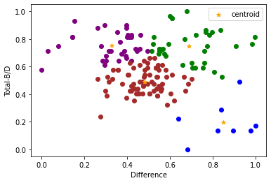
The array below has the centroids of our revised cluster
km.cluster_centers_
array([[0.68977366, 0.74952919],
       [0.84861111, 0.1970339 ],
       [0.32556614, 0.7535109 ],
       [0.48145145, 0.49175447]])
Now we have our revised cluster, with centroids added for extra insight. This cluster makes our previous doubts a little clearer. The subjects that rarely chose B/D lost the greatest money as shown below. Also although the B/D cards were clearly the most beneficial cards they too had a chance of a major loss, which can be seen from the particpants in the top left of our below cluster.
df1 = clustering[clustering.cluster==0]
df2 = clustering[clustering.cluster==1]
df3 = clustering[clustering.cluster==2]
df4 = clustering[clustering.cluster==3]

plt.scatter(df1.Difference, df1["Total-B/D"], color='green')
plt.scatter(df2.Difference, df2["Total-B/D"], color='blue')
plt.scatter(df3.Difference, df3["Total-B/D"], color='purple')
plt.scatter(df4.Difference, df4["Total-B/D"], color='brown')

plt.scatter(km.cluster_centers_[:,0], km.cluster_centers_[:,1], color="orange", marker="*", label="centroid")

plt.xlabel("Difference")
plt.ylabel("Total-B/D")
plt.legend()
<matplotlib.legend.Legend at 0x24255448f10>
Further analysis
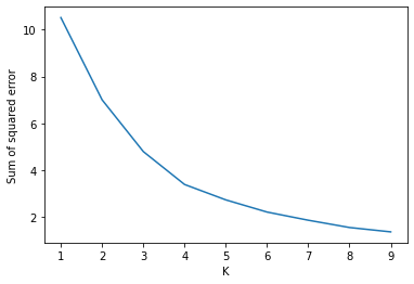
Our elbow graph does not have a dictinct breaking point. The optimum number of clusters is in the region of 3 and 4.
plt.xlabel("K")
plt.ylabel("Sum of squared error")
plt.plot(k_rng, sse)
#This is indictaing that the optimum number of clusters is 4 but 3 is also a reasonable choice
[<matplotlib.lines.Line2D at 0x2425550a310>]
Again the clusters aren’t overlapping and are showing relatively good dense clusters. Unfortuantely the scores aren’t nearer to 1 which is ideal.
from sklearn.metrics import silhouette_score
for n in range(2, 9):
    km = KMeans(n_clusters=n)
    km.fit_predict(clustering[["Difference", "Total-B/D"]])
    value = silhouette_score(clustering[["Difference", "Total-B/D"]], km.labels_, metric='euclidean')
    print(' Silhouette Score: %.3f' % value)
 Silhouette Score: 0.332
 Silhouette Score: 0.353
 Silhouette Score: 0.404
 Silhouette Score: 0.376
 Silhouette Score: 0.384
 Silhouette Score: 0.398
 Silhouette Score: 0.419
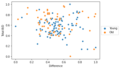
Lastly I wanted to briefly touch on the performance of the different ages. The scatterplot below shows us that the older participants were the bigger lossers but also the biggest gainers. Some of the older participants were blind to the pattern of the B/D cards where others were very quick to realise the two cards that were benfitting them. The younger group were in general more near the mean of the total study.
sns.scatterplot(data=clustering, x="Difference", y="Total-B/D", hue="AgeProfile")
plt.legend(loc='center left', bbox_to_anchor=(1.0, 0.5))
<matplotlib.legend.Legend at 0x24255970940>