Whole Dataset Clustering
Data preperation and clustering
Libraries used
import numpy as np
import pandas as pd

import matplotlib.pyplot as plt
import seaborn as sns

from numpy import arange

import sklearn
from sklearn import preprocessing
from sklearn.preprocessing import minmax_scale
from sklearn.cluster import KMeans
from mpl_toolkits.mplot3d import Axes3D

import sklearn.metrics as sm
from sklearn.decomposition import PCA
from sklearn.preprocessing import MinMaxScaler
from sklearn import datasets
from sklearn.metrics import confusion_matrix, classification_report
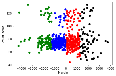
So for my clustering analysis of the whole study I would like to see if the studies as a whole have interesting cluster patterns. To do this step I will have to map an integer value to the study so that clustering can take place. I am focusing on the profit/loss margins of the individual subjects and I am also going to look at their total zeros received. This tells us how often the subjects didn’t lose money. The lower this figure is indicates that the subjects were losing money more regularly.
| index | Total W | Total L | Study | Margin | count_zeros | cluster | |
|---|---|---|---|---|---|---|---|
| 0 | Subj_1 | 5800 | -4650 | Fridberg | 1150 | 80 | 1 |
| 1 | Subj_2 | 7250 | -7925 | Fridberg | -675 | 71 | 3 |
| 2 | Subj_3 | 7100 | -7850 | Fridberg | -750 | 76 | 3 |
| 3 | Subj_4 | 7000 | -7525 | Fridberg | -525 | 76 | 3 |
| 4 | Subj_5 | 6450 | -6350 | Fridberg | 100 | 76 | 1 |
This is the results of our clustering based on the amount of zeros each subject chose and their respective margin of profit and loss.
df1 = clustering[clustering.cluster==0]
df2 = clustering[clustering.cluster==1]
df3 = clustering[clustering.cluster==2]
df4 = clustering[clustering.cluster==3]

plt.scatter(df1.Margin, df1.count_zeros, color='green')
plt.scatter(df2.Margin, df2.count_zeros, color='red')
plt.scatter(df3.Margin, df3.count_zeros, color='black')
plt.scatter(df4.Margin, df4.count_zeros, color='blue')

plt.xlabel("Margin")
plt.ylabel("count_zeros")
Text(0, 0.5, 'count_zeros')
Normalization and refined clustering
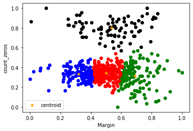
Below we can see the dataframe after normalization has taken place. The overall aim of normalization is to manipulate the values of the choosen columns in a particular dataset to a common scale. In machine learning normalization can improve learning rates and can also make weights easier to initialise. The main reason I am using normalization in my analysis is that I want to investigate whether it improves model accuracy dramatically or whether the results are very similar. I am also curious to see whether there is one variable that is steering the performance.
clustering[['Margin','count_zeros']] = minmax_scale(clustering[['Margin','count_zeros']])
km = KMeans(n_clusters=4)
y_predicted = km.fit_predict(clustering[["Margin", "count_zeros"]])
clustering["cluster"] = y_predicted
clustering.head()
| index | Total W | Total L | Study | Margin | count_zeros | cluster | |
|---|---|---|---|---|---|---|---|
| 0 | Subj_1 | 5800 | -4650 | Fridberg | 0.675000 | 0.404494 | 0 |
| 1 | Subj_2 | 7250 | -7925 | Fridberg | 0.446875 | 0.303371 | 1 |
| 2 | Subj_3 | 7100 | -7850 | Fridberg | 0.437500 | 0.359551 | 1 |
| 3 | Subj_4 | 7000 | -7525 | Fridberg | 0.465625 | 0.359551 | 1 |
| 4 | Subj_5 | 6450 | -6350 | Fridberg | 0.543750 | 0.359551 | 1 |
km.cluster_centers_
array([[0.69183361, 0.31542525],
       [0.50055668, 0.34221899],
       [0.53452744, 0.79761579],
       [0.31934307, 0.33429017]])
The below graph differs from the original in two mains ways. As I have mentioned already the data is now standarized, this should imrove the overall clustering of the dataset. I have also calculated the centroids of the clusters and added them to the graph giving us some added information.
df1 = clustering[clustering.cluster==0]
df2 = clustering[clustering.cluster==1]
df3 = clustering[clustering.cluster==2]
df4 = clustering[clustering.cluster==3]

plt.scatter(df1.Margin, df1.count_zeros, color='green')
plt.scatter(df2.Margin, df2.count_zeros, color='red')
plt.scatter(df3.Margin, df3.count_zeros, color='black')
plt.scatter(df4.Margin, df4.count_zeros, color='blue')

plt.scatter(km.cluster_centers_[:,0], km.cluster_centers_[:,1], color="orange", marker="*", label="centroid")

plt.xlabel("Margin")
plt.ylabel("count_zeros")
plt.legend()
<matplotlib.legend.Legend at 0x268e9917790>
Further analysis
k_rng = range(1,10)
sse = []
for k in k_rng:
    km = KMeans(n_clusters=k)
    km.fit(clustering[["Margin", "count_zeros"]])
    sse.append(km.inertia_)
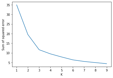
Below is a diagram of the elbow method. This enable us to find the optimum number of clusters in the dataset. It is the most popular method when dealing with k means clustering to calculate this. From the graph below you can the elbow starts to bend at 3 indicating that the optimum number of clusters would be three and that the results may improve with a correction.
plt.xlabel("K")
plt.ylabel("Sum of squared error")
plt.plot(k_rng, sse)
[<matplotlib.lines.Line2D at 0x268e9e820d0>]
Below is the silhouette score for these clusters. The silhouette score is a metric used to calculate the efficiency of a certain clustering technique. The closer the the silhouette scores are to 1 means that they are further apart from eachother. The scores below are not below 0 which is good and tells us that there arent any overlapping clusters. The closer to 1 indicates the more dense clusters, which we don’t seem to have in our case.
from sklearn.metrics import silhouette_score
for n in range(2, 9):
    km = KMeans(n_clusters=n)
    km.fit_predict(clustering[["Margin", "count_zeros"]])
    value = silhouette_score(clustering[["Margin", "count_zeros"]], km.labels_, metric='euclidean')
    print(' Silhouette Score: %.3f' % value)
 Silhouette Score: 0.577
 Silhouette Score: 0.428
 Silhouette Score: 0.356
 Silhouette Score: 0.375
 Silhouette Score: 0.372
 Silhouette Score: 0.338
 Silhouette Score: 0.350
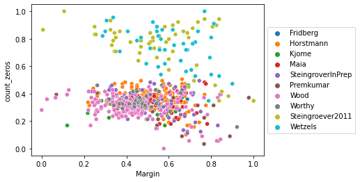
Here we have an informative scatterplot of the different studies and the participants. You can clearly see that the subjects from both Steingrover and Wetzels more often than not did not lose money and still gained a respective amount of money. Another interesting observation is that some of the participants that were not receiving many zeros, so as a result were losing money in some cases still gained a large amount of money. This tells us that these participants found the more beneficial cards but reaped the downside to those cards also.
sns.scatterplot(data=clustering, x="Margin", y="count_zeros", hue="Study")
plt.legend(loc='center left', bbox_to_anchor=(1.0, 0.5))
<matplotlib.legend.Legend at 0x268e9eb5ac0>